-

Painting, for me, has never been a hobby. It is not relaxing - writers and athletes would say the same. Since I was twelve, I have always painted unless I am interrupted. It is a labour, but it is what I do . . . a labour of love let us say.
Countless times I have talked with young people and beginning artists who are less young. Questions of my techniques and procedures often come up, so I figure it is time to write a bit about the subject.
First and foremost is the idea or the thought behind the painting. Although it is a joy to create something just for the sake of creating, it is much more satisfying to create something special. It may not necessarily be brilliantly executed, but ‘special’ means it comes from the heart and experience unique to you.
One definition of a masterpiece I have heard . . . when you see it, you should feel you are seeing for the first time, and it should look as if it is done without effort. This is a very, very tough yardstick. I wouldn’t say that I’ve ever done a masterpiece, but when I am struggling with each painting - and they are all a struggle - I often feel that I am nowhere near those two goals.
Sadly, I feel much wildlife art is just the opposite. When you see it, you feel you have seen it a thousand times before – yet another wolf, or another loon, or some other overworked subject done in the same old way. And, it looks as if it is done with a great deal of effort – every feather or every hair painted in great detail, but no sense of form or air or space or time, and often flat as a pancake.
- My own ideas come out of nowhere.
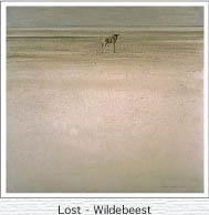
It may be from a film such as “Lawrence of Arabia” as it was for the composition of my lone newborn wildebeest.
 Lawrence of Arabia
My “White Encounter - Polar Bear” came out of a challenge I gave myself to paint most of a painting in a slender range of almost whites, like a composition on a piano in four notes high in the tonal treble clef. My “Midnight – Black Wolf” was the opposite challenge – to do most of the painting in four notes of the bass clef. 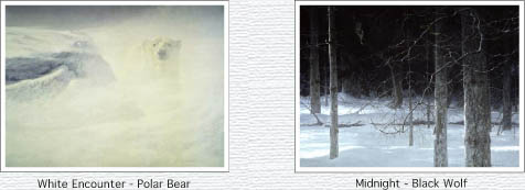
Everyone has his/her own muse. That is the fabulous thing about human creativity; each person’s is as unique as fingerprints or zebra stripes. The muse must be cultivated and she will come to you in unexpected ways.
Many of my ideas come, of course, from travels in the world but most come from around home. I often carry a camera – a single lens reflex [Canon in my case] with a telephoto zoom lens; 80mm to 300mm is a good range. I take pictures of bits of habitats that I find appealing.
I dislike front light, ie. the sun behind the camera, and always choose back light or side light, or diffuse light as in a cloudy day. I love mist because it describes the volume of air between the objects.
For subject matter reference, I avoid the spectacular and obviously beautiful. This is a question of taste. I leave that department to post cards. I have no need to paint it. Nowadays, I will deliberately seek out the opposite to the glorious . . . a scruffy bit of bush, some dead twigs or dead grasses. These slide references are like gold to me in capturing the particularity of an ordinary piece 
I also visit zoos and wildlife or waterfowl parks. In using these as photo reference, you must know what happens to captive creatures. Most cats get big bellies, birds often have their primary feathers clipped. Even though one visits the same zoo over and over, there are always surprises of lighting and pose and many other unpredictable factors.
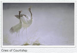
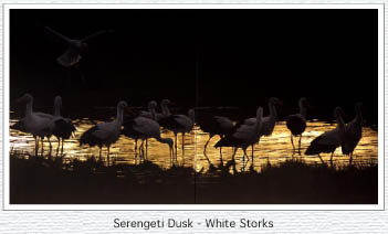
For those who are interested, here is a glimpse into my creative process . . . one of my ideas. I recently visited the Bronx Zoo and photographed a pair of white-naped cranes found in the Orient. No single photo of the many I took will do, but I hope to combine them in a life-sized, square painting of the pair. During that week in New York, I saw a large antique Japanese screen with whitish blossoms on a flat terracotta red background. The screen was edged in a broad band of gold leaf.I had recently used gold leaf in my painting “Serengeti Dusk – White Storks”. Now I have a gleam in my eye, or my soul, or somewhere, to paint two cranes on a flat rust background with a vertical gold band on each side. It may not work, in which case, I will modify it - or abandon it, hopefully before I invest too much time in it.
I try not to have parts of the picture fighting for dominance; either the habitat or the animal takes precedence, but not both. And, I try not to “throw in everything but the kitchen sink”. 
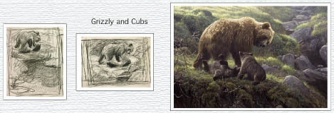
I have just discussed the most important aspect of my work. The technical details matter but are, to me, less interesting. I start with little sketches in pencil about the size of playing cards. I may do one or two or ten until I get the right composition. Since I was an abstract painter in my late 20’s and early 30’s, I can see the simplified shapes - or abstract qualities - on this small crude scale.
I then take my gesso coated masonite or canvas and get started. If the painting is under 24” x 36”, I usually use masonite. Above that, I use canvas because of the lighter weight, and the fact that I move my paintings and position around a lot. I use acrylic gesso thinned with water – about half and half - patting on three or four coats with a foam sponge.. After each coat dries,
I often sand it with black auto body sandpaper.
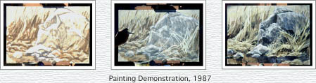
Most often I start right in with a medium paint brush and a medium dark colour as if I am doing a monochrome, thin water colour. I rough in the whole composition, including large area washes. Next I go over it all again with slightly lighter tones mixing white with the colours. Then I paint light strokes and highlights, often using white with a bit of yellow ochre. I use a limited palette of colour to harmonize in each picture.
I usually mix some white even with my darker colours to make them semi-opaque from the start. The painting progresses this way, starting out looser and bolder and gradually getting finer and more detailed, light on dark, dark on light, and so on.
I use liquid acrylic, any brand, kept in little jars about baby food size or in film canisters. Titanium white, yellow ochre, raw umber and Payne’s grey, plus a grey greenish mixture [of Prussian blue, raw umber plus a little Payne’s grey and white]. I premix the latter myself because I use it often in shading, snow, sky, etc.
For special subjects like bright flowers or birds, I have colours in lesser amounts in tubes: cadmium red light, cadmium yellow light, phthalo rose and phthalo blue or Prussian blue. Each tube lasts me several years.I also have a set of gouache paint cakes for little incidental colour adjustments. Of course, gouache is water soluble and therefore I need to add some acrylic to it on my palette, being careful not to get acrylic on the gouache cake itself.
I use artificial sable brushes of a variety of makes, riggers for fine lines and old worn ones for dry brush effects. For larger areas I use hog’s hair brushes or even house paint brushes.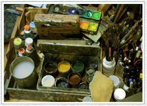 Paint Table
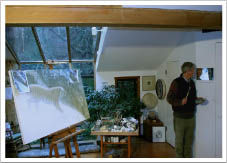
I have a mirror behind me and I sometimes get up and walk back to the mirror to view the painting in reverse. I got this idea from doing portraits many years ago. If something is ‘out of whack’, you can see it in the reflection. I find that if the painting is going well, it looks better in the mirror; if it has problems, they may become apparent. People often ask how long it takes me to do a painting. The answer is, I don’t know. I work on five to fifteen at once. I like them when I first start them, then they always get worse so I start a new one to cheer me up. By the time the fifth one looks really awful to me, the first one doesn’t look quite as bad, and a new idea about it may have come along so I can work on it for a while. One took me about six years off and on! 
Here are some suggestions I have given to artists whose work I have critiqued. As I mentioned earlier, the most important aspect is the idea . . . or the lack thereof, but there is not much to say on that score. Often aspiring artists hope to sell their work so they paint the most common popular subjects. I used to say to my students during 20 years of teaching high school art, “If you market target your art, it is a sure way of becoming a nobody.” This means you join hundreds of others in reploughing the same furrow and don’t express your unique self.
The next most common criticism is ‘cooking up’. This is a question of taste – I dislike the cooked up look. However, very famous painters including Chagall and Matisse, cooked up their art from their heads. I like Matisse, and Chagall fairly well, but I like Degas, Sargent and Wyeth much more. They base their work on the real world as their eyes have seen it. They make take liberties, but reality is the base. That is my taste.
Many aspiring artists cook up most of their picture, especially the habitat. Maybe they are lazy or ignorant and say to themselves, “I know what a spruce tree looks like”, and they cook one up in their mind. It looks, at best, like a plastic tree in a store. Every tree that ever lived, every branch, every clump of grass is unique. You can leave things out or change them around, but you should not fake them. You don’t have to tell the whole truth but tell nothing but the truth. God or Mother Nature has far more complex and unique arrangements of the world than our limited brains can cook up. We tend to be more stereotypical in our approaches to nature.
My usual way of looking at the real thing, in order to achieve ‘the ring of truth’, or verisimilitude, is to use photographs. These are mostly in the form of my slides. My viewer is made by Hanimex in Japan, with a small ground glass screen and reflecting mirror. Unfortunately, they stopped making them over 25 years ago. I usually have it mounted on a tripod head with a small LED light shining on the ground glass screen, which is actually plastic.
I can move the tripod so that my eyes don’t have to travel far from the subject reference to the painting. This is very important. The ergonomic relationship of your painting to your paints and reference should be as close as possible. Even a split second delay between seeing your image and putting your eyes on the painting, can lose particularity.
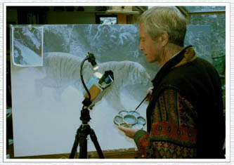
Sometimes I have part of the slide that I can’t see well enlarged on the computer and brightened so that I can see it better. Then I tape that near the appropriate area in the painting. Of course, this obsessive copying of the photo does not go on all the time. As I said, I usually move things around and almost always use many photos - up to 50 - in the average painting. Once I have everything with as much ‘ring of truth’ as I want, I start to take liberties by changing things, eliminating things, playing with light and shade, etc. Towards the end, it may not look like the photos at all.
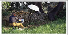
I could never understand why some artists shrank from using photographs. Many, many years ago, I can remember students asking in hushed tones, “Is it all right to use photographs?” I have never heard of a good reason not to. One person said that it could make your work tight and unexpressive. Well, my wife uses photos for her painting and she is a bold, abstract artist and very expressive. Others whose work is loose and free and painterly do as well. In fact, in the last several decades I don’t ever hear that question. Everybody uses photographs if they are at all interested in realism. Even modernists and post modernists such as Warhol, Rauschenberg and Richter show photo-based paintings which are in the collections of big city museums.By the way, if you have a subject that does not change much and you are able to work in the field, it can be a wonderful alternative to photography. The real thing is great and has the added benefit of being out in nature with the smells, sounds, and general fresh ambiance. I used to only work in the field and made it a point of honour to never touch a painting after I left the field. Now I go from time to time to work on drawings and paintings ‘en plein air’ with no photo reference. I am usually with a group such as the international “Artists for Nature Foundation” (www.anf-yb.nl). The point is still the same – good reference for your painting - whether in the field or from photos.
So then, my criticism of much beginner work I see is:
a) lacking in idea and
b) lacking in use of good reference.
My other observation is:
c) too much attention is paid to detail and not enough attention to form, light and space.
One often sees paintings with painstaking detail of creatures and landscapes that look as flat as a pancake. I hasten to add that there is nothing wrong with this. Artists from Paleolithic times through Medieval times to Picasso have done superb and very flat art.
But if realism is your goal, you missed your mark if you are flat. Form is shown by light and shade - check the paintings of Vermeer and Rembrandt.
The sense of space is shown by air. And air neutralizes tone and colour. The further away, the paler the darks and the duller the light areas appear. If white is zero and black is ten, I almost never use zero and ten even less so. There is no 100% black, or ten in my “Midnight – Black Wolf” painting. I hold those extremes back like an ace in a card game and play them only for special emphasis.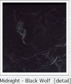
To create my misty effects I use a foam rubber sponge [palm size with the edges plucked off] with a thin wash of white, sometimes adding a bit of raw umber or Payne’s grey or yellow ochre depending on whether there is mist or dust, etc. I pat it until dry. When a paler colour is put over dark, it always looks dead purplish, so I paint it paler than it will end up, then bring it back to life with a very thin, darker wash. You must not be a slave to the colour or tone of the creature. Bald eagles have more or less white heads and black wings but the highlighted parts will be paler and the shaded parts will be darker than the actual colour of a flat skin. I have shown an eagle with a charcoal throat that is darker than the highlights on the wing. All parts of the painting should have consistent light and shadow including the creature and the habitat. For a given angle of surface, the light and tone would be the same. Therefore if a surface is at a different angle, the tone will be different. 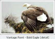
I hope that you have found some helpful ideas. Best of luck because one always needs it. 

- My own ideas come out of nowhere.